Copperplate is the pointed-pen script behind wedding invitations and vintage elegance. It looks like it requires years of art school. It doesn't. You need an oblique pen holder, a few flexible nibs, smooth paper, and a willingness to practice the letterforms. The toolkit costs under $40, and within a month you'll be writing things that stop people in their tracks.
By Colin B. · Published June 14, 2026 · Last reviewed June 14, 2026
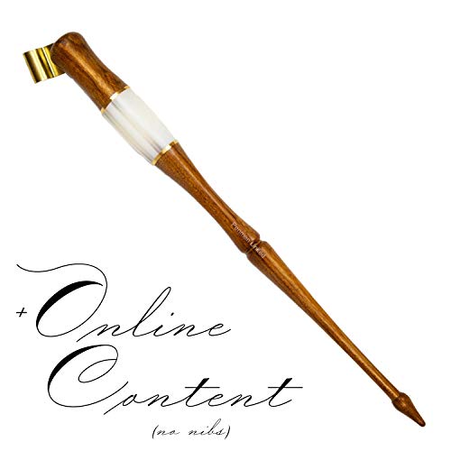
Speedball Oblique Pen Holder
— The adjustable oblique pen holder every beginner starts with. Under $7 and fits all standard nibs.
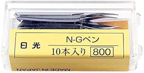
Nikko G Nib (10-Pack)
— The forgiving beginner nib. A 10-pack lasts months while your pressure control is still developing.
Rhodia No. 16 Notepad
— Silky-smooth practice pad that won't snag your nib. One pad is a month of focused practice sessions.
Budget total
$30
Typical total
$55
A full copperplate starter kit (oblique holder, 10-pack of nibs, india ink, and a Rhodia pad) runs under $40. Add a light pad for tracing guideline sheets and you're at $55-60.
We earn commission on qualifying Amazon purchases — see our
affiliate disclosure.
Price tiers and budget totals shown above are editorial estimates;
actual Amazon prices vary.
At a glance
Our top pick in each category
The fastest path through this guide — each best-starter pick by category.
Scroll for the budget and upgrade alternatives.
The oblique pen holder is not optional for copperplate. It's the tool that aligns your nib to the correct slant angle (52-55°) without forcing you to contort your wrist. Right-handed beginners who start with a straight holder spend months fighting the angle instead of learning the letterforms.
Your first nib will spray ink everywhere, and that's not a defective nib. New nibs have a factory coating that repels ink. Scratch both sides with an old match or rub with a little toothpaste, rinse under water, and you're ready. Do this with every new nib before first use.
Smooth paper is non-negotiable. Copperplate hairlines are fine enough to catch on medium-texture surfaces and shred your nib or spray ink. HP 32lb laser paper from any office supply store performs better than most expensive art papers for daily practice, and costs almost nothing per sheet.
The gear
What you actually need
Pen Holders
The oblique pen holder is what makes copperplate copperplate. Unlike a straight holder, the angled barrel and brass flange position the nib at roughly 52-55° automatically, the slant every copperplate letterform is built around. Beginners who skip the oblique holder spend months fighting geometry instead of learning strokes. An adjustable-flange oblique holder is the right starting point: different nibs seat at slightly different angles, and the adjustable version accommodates all of them. Save the fixed-flange artisan holders for after you know exactly which nibs you prefer.
Pen Holders — what's the difference?
A few common shapes, each making a different trade.
Oblique Holder
Standard for copperplate; angles the nib to 52-55° automatically.
Nib angle
52-55° automatic
Best hand
Right-handed
Best for Right-handed beginners learning copperplate and Spencerian scripts
Tradeoff Requires slight adjustment when switching between different nib brands
Straight Holder
Better for left-handers or broad-nib italic, not copperplate.
Nib angle
Inline (manual slant)
Best hand
Left-handed or italic
Best for Left-handed calligraphers or those learning italic and gothic scripts
Tradeoff Right-handers learning copperplate will fight the slant angle all session
Best starter
Speedball
Oblique Pen Holder
$
★★★★★Our rating
The Speedball oblique is the starting point for almost every copperplate beginner, and for good reason. The adjustable brass flange holds any standard nib securely at the correct slant angle, it costs under $7, and it's widely available. Buy this before you experiment with anything fancier.
What we like
Adjustable brass flange fits virtually all standard nibs
Under $7, the lowest-risk entry point for the hobby
Widely recommended; tutorials assume you're using this holder
What to know
Lightweight plastic feels flimsy compared to wood or resin holders
Flange needs re-bending when switching between nib families
Comes with an oblique holder and a nib assortment, which saves a step if you don't want to source nibs separately. The quality of both the holder and nibs is decent, not exceptional, but it gets you writing for under $15 without requiring a second order.
What we like
Includes both oblique holder and a nib variety pack in one box
Good way to try multiple nibs without placing a second order
What to know
Nib selection is mixed; some are more useful for copperplate than others
Holder quality is a step below Speedball's adjustable flange
Once you know which nibs you love and what angle you prefer, a well-made wood or resin holder is a real upgrade in feel and balance. Better weight distribution reduces hand fatigue in long sessions. The fixed-flange versions lock you into one nib family, so verify the fit before buying.
What we like
Better balance and weight reduces hand fatigue in longer sessions
Durable; a quality holder lasts decades with basic care
What to know
Fixed flange commits you to one nib family
Higher price requires knowing your nib preferences first
Copperplate uses flexible pointed nibs: the tines spread under downstroke pressure for thick strokes, then snap back to produce thin hairlines on upstrokes. That contrast is what makes copperplate beautiful. Different nibs have different levels of flexibility; as a beginner, start with a stiffer, more forgiving nib and work toward more flexible ones as your pressure control improves. A 10-pack of nibs in the $5-8 range lasts months. Always clean nibs after every session; ink left to dry corrodes the tines within days and the nib turns scratchy.
Best starter
Nikko
G Nib (10-Pack)
$8.80 as of Jun 22, 2026
★★★★★Our rating· In Stock
The most commonly recommended beginner nib in copperplate for a reason. The Nikko G is stiff enough to be forgiving when your pressure control is still developing, produces clean hairlines, and lasts longer than most flexible nibs. The 10-pack is the right format. You'll ruin a few before the pressure starts clicking.
What we like
Stiff enough to be forgiving while pressure control is still developing
Longer lifespan than more flexible nibs
Community standard; tutorials assume you're starting with a G nib
What to know
Stiffness requires deliberate pressure for strong thick-thin contrast
Will feel limiting once your control improves; plan to graduate
The Zebra G is the Nikko G's closest sibling: slightly more flex, a bit more forgiving on ink flow, and equally reliable. Many calligraphers keep both, using Zebra for everyday practice and Nikko for finished pieces. A 10-pack is cheap enough to experiment freely.
What we like
Slightly more flex than Nikko G for more expressive thick-thin contrast
Consistent quality; very few duds in a pack
What to know
More flex means slightly less forgiving of pressure-control errors
Similar enough to Nikko G that buying both early is mostly redundant
★★★★☆Our rating· Only 9 left in stock - order soon.
The Brause Rose is a classic copperplate nib: extremely fine point, high flex, and beautifully responsive under pressure. The lines it produces are stunning when your technique is there. Wait until you've used a full pack of Nikko G nibs before switching to the Rose. It will magnify every technique error you still have.
What we like
Extremely fine point for delicate hairlines
High flex produces dramatic thick-thin contrast in skilled hands
What to know
Unforgiving; catches paper at wrong angle or with ink buildup
Shorter lifespan than G nibs; plan to replace more frequently
Copperplate nibs are designed for liquid dip inks, not brush-calligraphy markers or thick gel inks. Consistency matters: too thin and ink floods the page; too thick and it won't flow from the nib. Black india ink and iron gall ink are the traditional choices. Avoid metallic or pearlescent inks in your first few months; shimmer particles clog fine tines and are difficult to clean out. Walnut ink is a warm brown alternative worth exploring once you're past the basics.
Best starter
Speedball
Super Black India Ink
$9.49 as of Jun 22, 2026
★★★★★Our rating· In Stock
Dense, opaque, and consistent. Speedball Super Black is the default first ink for pointed-pen calligraphy. It flows well at the right pen angle, doesn't flood new nibs, and dries waterproof. If your nib repels ink on the first dip, the issue is the factory coating on the nib, not the ink.
What we like
Opaque, high-contrast black that scans and photographs beautifully
Waterproof when dry, safe for finished pieces
Widely available in sizes from 1 oz to 8 oz
What to know
Carbon sediment settles fast; needs shaking every few minutes during use
Can run slightly fluid on very slick paper; thin drips are common early on
Iron gall is the ink behind centuries of manuscript calligraphy. It's slightly more viscous than india ink, flows naturally with flex nibs, and dries to a warm-black that ages beautifully. The tradeoff: iron gall is mildly acidic and will corrode steel nibs if left to dry. Rinse your nibs immediately after every session.
What we like
Traditional archival ink with centuries of manuscript pedigree
Slightly self-wetting quality; flows consistently with flex nibs
Warm-black finish that improves in character with age
What to know
Mildly acidic; corrodes steel nibs if left to dry overnight
Reacts badly with nibs that have existing corrosion; start with fresh nibs
A premium india ink that flows more consistently than Speedball out of the bottle, with less need for shaking between strokes. The carbon particle size is finer, which means it clogs nibs slightly less during long sessions. Calligraphers who scan or photograph finished work often prefer it for the darker, more even tone.
What we like
Finer carbon particles; clogs nibs less in long practice sessions
More consistent flow out of the bottle; less shaking required
What to know
More expensive per ounce than Speedball
Difference is subtle for beginners; Speedball is fine until you're ready to upgrade
Copperplate nib hairlines are fine enough to catch on medium-texture paper, spray ink, and shred. You need smooth paper. The good news is that the best practice surface is cheap: HP 32lb laser paper costs almost nothing and is one of the most-recommended beginner surfaces in every calligraphy community online. Graduate to Rhodia or Clairfontaine once you want nicer feel and cleaner finished pieces. Do your first month of drills on the cheap stuff without guilt.
Best starter
Rhodia
No. 16 Notepad
$24.51 as of Jun 22, 2026
★★★★★Our rating· In Stock
Rhodia's 80g paper is smooth enough that a Nikko G glides cleanly across it, and the sheets are heavy enough to handle multiple ink passes without show-through. The dot-grid version is useful for practicing consistent x-height. At around $10, one pad is a solid month of practice for most beginners.
What we like
80g weight handles multiple ink passes without ghosting through
Smooth enough for fine copperplate hairlines without snagging
Dot or grid options help maintain consistent letter height
What to know
Pricier per sheet than printer paper alternatives
Narrower page size limits long practice words or pangram drills
The most-recommended cheap practice surface among pointed-pen calligraphers. Smooth enough for hairlines, won't bleed, and costs almost nothing per page. This is what you should use for your first month of drills. Save the Rhodia for pieces you want to keep.
What we like
Near-zero cost per sheet; practice without guilt or rationing
Smooth enough for copperplate hairlines; praised in calligraphy communities
What to know
Thinner feel than Rhodia; not suitable for finished pieces
Some iron gall inks feather slightly on laser paper; test before committing
Clairfontaine's Triomphe paper is 90g and exceptionally smooth, the 'glass paper' calligraphers talk about in forums. Better for formal correspondence and finished work than for daily drills. If you're writing something you'll frame or mail, reach for Triomphe.
What we like
90g weight handles wet inks without any show-through
Extra-smooth finish produces the cleanest possible hairlines
What to know
Premium price makes it wrong for daily practice drills
Less common in local stores; usually needs to be ordered online
The copperplate slant (52-55° right lean on every letter) is not something you eyeball, at least not for the first few months. Beginners use guideline sheets: printed slant lines and x-height guides slipped under their practice paper. A light pad ($20-25) makes this effortless: slide any guideline PDF underneath, and the lines show through, training your eye and hand simultaneously. A structured workbook gives you letterforms and drill sequences in one place, so you're not hunting for resources in the middle of a practice session.
Best starter
Artograph
LED LightPad 9" x 12"
$$
★★★★★Our rating
A light pad is the most practice-unlocking $20 you'll spend in copperplate. Print the free guideline PDFs from IAMPETH or Paper and Ink Arts, slip them under your smooth practice paper, and the slant lines show through every session. You'll maintain correct angle from day one instead of drifting for months.
What we like
Unlocks unlimited free guideline PDFs from IAMPETH and Paper and Ink Arts
Works for any paper, any guideline template, and other tracing projects
Thin, rechargeable, and doesn't take much workspace
What to know
Adds $20-25 to startup cost
Some brands wash out thinner paper at max brightness; check settings
Mastering Copperplate Calligraphy by Eleanor Winters
$14.63 as of Jun 22, 2026
★★★★☆Our rating· In Stock
Eleanor Winters' classic is the structured workbook behind many serious copperplate learners. Every letterform gets a stroke-by-stroke breakdown, with drill pages included rather than just finished examples. One of the few books that teaches the why of each stroke, not just what it should look like.
What we like
Stroke-by-stroke breakdowns for every letterform, upper and lowercase
Drill pages included; structured practice, not just examples to copy
What to know
Dense, textbook-style presentation; not a quick or casual read
Supplement with YouTube for seeing the pen and pressure in motion
Copperplate looks intimidating right up until the moment it doesn't. Here's what's actually happening in your first month, week by week, from your first flooded nib to your first piece worth framing.
Copperplate calligraphy has a reputation for being the ornate script you admire on someone else’s wedding invitation and assume requires ten years of art school. That reputation is mostly wrong. The learning curve is real, but it’s also faster than most people expect, and the first recognizable letters come sooner than you’d think.
This is what your first month actually looks like, week by week, including the parts nobody mentions: the ink flooding, the nib catching, the moment the pressure control suddenly clicks, and the specific things that will frustrate you before they stop frustrating you.
Week 1: Tools, setup, and your first disaster session
Before you write a single letter, you need to prime your nib. Every new pointed nib ships with a factory coating that repels ink, and if you don’t remove it, your ink will bead off and your first session will feel like the nib is actively working against you. The fix is simple: rub both sides of the nib gently with a little toothpaste, rinse under cold water, and dry. Do this with every new nib. Once primed, load ink by dipping just the reservoir opening (not the entire nib) into the bottle.
The oblique pen holder feels strange in your hand for the first session. That’s normal. The barrel angles the nib away from you, which looks awkward but is what creates the copperplate slant (roughly 52-55° right lean) automatically, without forcing your wrist into an unnatural position. Resist the urge to switch back to a straight grip. Give the oblique holder a week before you judge it.
Your first drill is not a letter. It’s the basic oval: a thin upstroke entering from the bottom left, then a thick downstroke that curves back to close the shape. The thin-thick-thin rhythm of that single shape is the foundation of every copperplate letterform. Practice it until the contrast feels natural, which usually takes one or two sessions.
The first session will involve: ink flooding (too much ink on the nib), ink refusing to flow (too little, or a coating you didn’t fully remove), the nib catching on the paper and spraying, and letters that look nothing like the model you’re working from. This is entirely normal. Don’t adjust your tools. Adjust your paper.
By the second week, your flooding problem is mostly solved (you’ve learned how much ink to load), and you’re starting to recognize when a nib is clogging mid-session versus when your angle is off.
Pressure control is the core skill in copperplate. Downstrokes are heavy, the tines spread and the stroke widens. Upstrokes are feather-light, the tines stay together and produce a hairline. The hardest part isn’t applying the pressure; it’s releasing it cleanly as you transition from a downstroke back up. Most beginners apply heavy pressure on upstrokes out of habit, and the result is a uniform-weight stroke that looks nothing like copperplate.
The practical drill: write the letter i over and over. It has one downstroke (thick) and one upstroke (hairline), and the transition between them is exactly the skill you’re building. When your i looks right consistently, the rest of the lowercase follows naturally, because almost every lowercase letter is built from the same oval and downstroke combination.
The lowercase letters to learn in order, because each one adds one new stroke to what you already know:
i, u, n, m (downstroke + upstroke transitions)
a, g, q (oval + downstroke)
o, c, e (pure oval variations)
l, b, h, k (tall letterforms with ascending loops)
f, j, p, y, z (descending loops and exceptions)
Work through that sequence and you have the full lowercase alphabet in a logical order rather than A-to-Z, which is arbitrary from a stroke perspective.
Week 3: Connecting letters and writing words
Week three is where copperplate either hooks you or discourages you, depending on how much you practiced in week two. Connecting letters is harder than writing them individually, because the exit stroke of one letter has to flow into the entry stroke of the next at exactly the right angle.
The trick is maintaining consistent slant through the connection. When letters connect at odd angles, the word looks like a ransom note. The slant lines on your guideline sheet (which you’re still using, every session) are the check. If both letters in a pair are at the correct slant, the connection stroke will look right automatically.
Start with short, slow words before trying to write naturally. minimum, nun, union are classic practice words because they’re built almost entirely from downstrokes and upstrokes, so the connections are all the same shape. When those feel easy, try moon, mane, nine. Only after those are you ready for words with awkward letter combinations.
A word about slant sheets: don’t stop using them in week three just because you feel like you have the angle. You probably don’t, not yet. The slant becomes intuitive after about a month of consistent practice, not two weeks. Use the light pad under your paper and let the guidelines do the work.
Week 4: Uppercase letters and learning what to improve
Uppercase copperplate letters are harder than lowercase. They have loops, flourishes, and compound curves that don’t reduce to a simple oval-plus-downstroke. Most calligraphy teachers recommend spending your first month almost entirely on lowercase and reserving uppercase for month two.
If you’re in month one, learn the uppercase letters that show up in short names (your own name, names you want to address envelopes to) and hold off on the full uppercase alphabet until your lowercase is solid. An A that looks like a graceful copperplate capital is much harder to execute than it looks, and practicing it before your basic pressure control is automatic will slow you down, not accelerate you.
By the end of week four, you should be able to write short words with consistent slant and at least some visible thick-thin contrast. The contrast won’t look professional. The letterforms won’t all be equally good. That’s correct. Month one is about building the habits (guideline sheet, nib priming, consistent ink loading, regular cleaning) and the basic stroke vocabulary. The good-looking writing comes from compounding those habits over months, not weeks.
Every copperplate beginner fails at the same handful of things. Knowing the list makes the failures less discouraging:
Ink flooding in the first few minutes of a session. The nib is still adjusting to the ink temperature and your paper. Don’t diagnose the problem; just make a few warm-up oval strokes on scrap paper before working on anything real.
The upstroke hairline going thick. You’re applying downstroke pressure when you should be feathering. This is the most common beginner error and it corrects itself with repetition, not with thinking about it.
Letters going off-slant halfway through a word. Your attention drifted from the guideline. Look at the slant line under your paper, not just the letter you’re currently writing.
The nib catching and spraying mid-word. Ink has built up between the tines. Dip the nib in your water jar and flick it dry; you’ll be able to finish the word.
Beautiful individual letters, ugly words. The connections are the hard part. This is a month-two problem, not a week-one problem. Stop worrying about words until your individual letters are consistent.
Nobody looking at a beginner’s copperplate is judging you by the same standard as a professional engraver. They’re watching someone build a skill in real time, which is genuinely interesting.
What to do in month two
A few things change the slope of your improvement once the basics are in place:
Switch from guideline tracing to freehand with occasional checks. Slide the guideline sheet out and practice a few words without it, then check your slant against the guidelines. The gap closes faster than you’d expect.
Try iron gall ink. It behaves slightly differently than india ink and reveals new things about your pressure control. The slightly higher viscosity makes thin hairlines easier to control.
Work on a specific word or phrase you actually want to use. Purposeful practice (a name you want to address, a quote you want to frame) is more effective than drills for the same number of minutes.
Find someone else who does copperplate. One session comparing your work to another beginner’s, or a short critique from someone more advanced, is worth weeks of solo practice. The r/Calligraphy community does progress-post feedback.
You’re not an expert at month two. You’re someone with a real skill that’s still developing, and the letters look like something, which is not nothing.
Save your money
What you don't need yet
Beginners get pressured to buy a lot of stuff that doesn't help them play
better. Here's what we'd skip on day one.
A parallel pen or chisel-tip calligraphy set — Those are broad-nib tools for italic and gothic scripts. Copperplate is a completely different discipline with completely different tools.
Gum arabic or ink additives — India ink flows well from a pointed nib without modification. Additives help experienced calligraphers tune specialty inks; they're not a beginner fix.
Vellum or parchment paper — Beautiful finish, but expensive and not ideal for daily drills. HP laser paper performs better for practice and costs almost nothing per sheet.
Multiple pen holders — One adjustable-flange oblique holder covers every standard nib. Multiple holders only make sense once you have strong preferences for specific nib families.
A formal paid calligraphy course — IAMPETH's online resources and The Postman's Knock's free lessons cover months of beginner content at zero cost. Take a paid course after you've gone through the free material.
First week
Your first seven days
A short, real plan to get from gear-on-doorstep to actually playing.
Order the three essentials: oblique pen holder, Nikko G nibs, and Speedball Super Black India Ink. · Buy
Watch a 15-minute intro video before picking up the pen. The Postman's Knock has one of the clearest beginner breakdowns on YouTube. · Learn
The Postman's Knock · Lindsay Weirich's beginner-friendly YouTube calligraphy channel
Prime your first nib before inking it: rub both sides with a little toothpaste, rinse under water, and dry. Every new nib needs this step. · Action
Practice the basic oval and the upstroke/downstroke drills for 20 minutes before touching a letter. Every copperplate letterform is built from these two strokes. · Action
Expect the first session to be messy. Ink will flood, the nib will catch, the angle will feel wrong. All of this is normal and temporary. · Action
FAQ
Common questions
How is copperplate different from regular calligraphy?
Copperplate uses a flexible pointed nib and is defined by the thick-thin contrast created by varying pressure on downstrokes versus upstrokes. Most beginner 'calligraphy' kits use broad-nib or chisel-tip tools (Tombow markers, calligraphy fountain pens) that are a completely different discipline. Copperplate is more technically demanding, more historically rooted, and produces a more formal, elegant script.
Do I really need the oblique pen holder, or can I start with a straight one?
You really need the oblique holder for copperplate. The copperplate slant (52-55° right lean) is nearly impossible to achieve consistently with a straight holder unless you have an unusual wrist position or are left-handed. Right-handed beginners who start straight spend months fighting the angle. Just start oblique — it's a $7 investment.
Why does my nib scratch and spray ink everywhere?
Two most common causes: the factory coating on a new nib (fix: prime it with toothpaste, then rinse), or ink buildup between the tines mid-session (fix: dip in your water jar and flick dry). A third cause is too much pressure on upstrokes. Copperplate rewards light upstroke pressure and deliberate downstroke weight, not uniform pressing.
How long until my writing actually looks good?
Most people can produce recognizable copperplate letters within a few sessions. Writing that looks genuinely good takes 3-6 months of regular practice (20-30 minutes, 3-4 times a week). The milestones come in order: consistent slant first, then consistent thick-thin contrast, then smooth entry and exit connections. Each one is its own small breakthrough.
Is copperplate the same as Spencerian script?
Similar but distinct. Both are pointed-pen scripts from the same American penmanship tradition. Spencerian is lighter and more oval-based; copperplate (also called Engrosser's Script) uses heavier shading on downstrokes and has a slightly more formal look. The tools overlap almost completely. If you learn copperplate, picking up Spencerian later is a natural next step.
IAMPETH — International Association of Master Penmen, Engrossers and Teachers of Handwriting. The definitive organization for serious penmanship. Free lessons and practice sheets on the site.
The Postman's Knock — Lindsay Weirich's site with hundreds of free calligraphy tutorials. The beginner copperplate series is one of the clearest introductions available online.
Paper and Ink Arts — Best-stocked calligraphy supply site. Free guideline PDFs, nib selector, and a detailed education section on copperplate tools and technique.
r/Calligraphy — Active subreddit with a helpful wiki. The pinned beginner guide covers tools and practice resources specifically for pointed-pen work.
As an Amazon Associate, JustBeginning earns from qualifying purchases.
We may also earn commission from other affiliate programs linked on this
page. Editorial recommendations are independent; we don't choose
products based on commission rates.
Product prices and availability are accurate as of the date and time
indicated and are subject to change. Any price and availability
information shown on Amazon at the time of purchase will apply.

 Best starter