Modern calligraphy is one of the most rewarding slow hobbies you can start. The learning curve is real but shorter than it looks. Within a month of consistent practice, your letters will look like actual calligraphy. Here's exactly what you need to get there, and what you can skip entirely.
By Colin B. · Published May 15, 2026 · Last reviewed August 7, 2026
Calligraphy is one of the most affordable creative hobbies. A brush pen set and a good pad is all you need on day one.
We earn commission on qualifying Amazon purchases — see our
affiliate disclosure.
Price tiers and budget totals shown above are editorial estimates;
actual Amazon prices vary.
At a glance
Our top pick in each category
The fastest path through this guide — each best-starter pick by category.
Scroll for the budget and upgrade alternatives.
Brush pens and dip pens are two completely different tools with different learning curves. Brush pens are forgiving, portable, and require zero setup; pick them up and write. Dip pens (a holder with a flexible metal nib you load with ink) give you the classic swelled-stroke calligraphy look but demand more patience upfront. Start with brush pens unless you have a specific style in mind that requires a nib.
Paper matters far more than beginners expect. Standard printer paper drags on your nib, causes ink to feather sideways into the fibers, and makes consistent strokes nearly impossible. A smooth laser paper or a Rhodia dot pad costs under $20 and changes the experience completely. Buy the paper before anything else.
Don't buy a calligraphy kit. Amazon calligraphy kits almost universally include scratchy beginner nibs that catch on paper and blob ink unpredictably, which makes calligraphy feel hard when the tool is just wrong. Build your own kit from individual pieces (a solid pen, the right ink, the right paper), and you'll have gear that actually cooperates.
The pen vs. brush pen choice is the first real fork in the road. Brush pens are more beginner-friendly (no ink loading, no nib to flex, just pick up and write). They produce excellent modern and brush-lettering script. Dip pens with flexible pointed nibs give you the traditional calligraphy look (thin hairline upstrokes, thick swelled downstrokes), but take a few hours to get comfortable with. Start with brush pens if you want immediate progress. Move to dip pens once you're hooked.
Pens & Nibs — what's the difference?
A few common shapes, each making a different trade.
Brush Pens
Forgiving, portable, no setup. The modern calligraphy entry point.
Setup
None
Line variation
Moderate (pressure-based)
Portability
High
Ink choice
Limited to pen colors
Best for Beginners, modern/brush lettering, on-the-go practice
Tradeoff Less dramatic hairline-to-swell contrast than pointed nibs
Wide chisel-edge nib. Thick-thin variation comes from angle, not pressure.
Setup
Holder + nib + ink required
Line variation
Automatic (from nib angle)
Portability
Low
Styles
Gothic, Italic, Uncial, Roman
Best for Gothic, Blackletter, formal italic, historical scripts
Tradeoff Less intuitive for modern/flowing script styles
Best starter
Tombow
Dual Brush Pen Art Set (10-Pack)
$22.28 as of Jun 22, 2026
★★★★★Our rating· Only 10 left in stock - order soon.
The most recommended entry point in modern calligraphy, and justifiably so. The dual tip gives you a flexible brush end for letterforms and a fine tip for details. The brush tip responds to pressure the way a pointed nib does (thin on upstrokes, thick on downstrokes), but with a built-in ink supply and zero setup time. Start here.
What we like
Zero setup: uncap and write immediately, no ink loading required
Dual tip covers both calligraphy letterforms and fine detail work
10 colors let you explore beyond black from day one
What to know
Less dramatic thick-thin contrast than a flexible pointed nib
Under $5 for a single pen, and the brush tip is noticeably more flexible than Tombow's, which means more pressure-dependent line variation for less money. Not as consistent as the Tombow set, but a genuinely good way to test whether brush calligraphy is for you before committing more. Buy two or three if you plan to practice daily.
What we like
Softer, more flexible tip than Tombow, with more pressure-responsive line variation
Under $5 makes it genuinely low-stakes to test brush calligraphy
What to know
Less consistent than Tombow; can skip on extended downstrokes
When you're ready to move to dip pen calligraphy, this is the holder to start with. The oblique (angled) flange positions your nib at the angle Copperplate and Spencerian styles require. A straight holder will have you fighting your wrist the whole time. Buy it alongside a pack of Nikko G nibs, which go in the flange perfectly.
What we like
Oblique flange positions the nib at the correct Copperplate angle automatically
Compatible with most standard nibs including the popular Nikko G
What to know
Requires separate ink and nib purchase, not a standalone beginner buy
The most popular pointed nib for beginner calligraphy in the world, and for good reason: stiff enough not to catch on paper unpredictably, flexible enough to produce real line variation. A pack of 10 will last months. Replace a nib when it starts feeling scratchy or skipping (they're consumables).
What we like
Stiff enough for beginners but flexible enough to produce real line variation
10-pack price makes nib replacement a non-event; just swap and keep writing
What to know
Factory oil coating must be removed before first use or ink beads off
Requires a pen holder, ink, and smooth paper to work properly
For brush pens, ink is built-in. Skip this category until you move to a dip pen. For dip pens, you need ink that flows smoothly, stays where you put it, and doesn't skip or blob. India ink is the standard: dense, consistent, and permanent once dry. Start with one excellent black. A single 2 oz bottle lasts months of practice; don't buy ink in sets when you're just starting.
Best starter
Speedball
Super Black India Ink
$9.49 as of Jun 22, 2026
★★★★★Our rating· In Stock
The most widely used calligraphy ink for a reason: thick, opaque, and consistent. It doesn't skip, doesn't feather on smooth paper, and dries jet black. A 2 oz bottle will last a full beginner year. Don't overthink ink. Just get this one.
What we like
Thick, opaque, and consistent, no feathering on smooth paper
A 2 oz bottle lasts a full year of regular beginner practice
What to know
Clogs nibs quickly if left to dry; rinse after every session
★★★★☆Our rating· Only 6 left in stock - order soon.
The standard for white ink over dark paper or colored backgrounds. Covers completely, doesn't turn gray when it dries, and can be thinned with water for different consistencies. Once you start doing dark envelopes or colored card stock, this is the only white ink you'll want.
What we like
Genuinely opaque white that stays bright after drying, not gray or transparent
Thinnable with water to adjust flow for different surface types
What to know
Settles fast; needs shaking and stirring before every single use
Paper is the most underrated variable in calligraphy and the one that trips up beginners more than anything else. Coarse paper fiber grabs your nib or brush tip, causing jagged strokes and ink feathering (the fuzzy edges that make letters look soft and weak). Smooth paper lets the tool glide. A Rhodia dot pad or a pack of HP Premium LaserJet paper (genuinely excellent for calligraphy despite being printer paper) will immediately make your practice look and feel better.
Best starter
Rhodia
No. 16 A5 Dot Pad
$7.89 as of Jun 22, 2026
★★★★★Our rating
Rhodia paper is famous among fountain pen and calligraphy enthusiasts for one reason: it is remarkably smooth. Ink glides, nibs don't catch, and the dot grid gives you visual reference for spacing and slant without being as intrusive as ruled lines. The A5 size is perfect for daily practice sessions.
What we like
Exceptionally smooth surface, nibs glide without catching or feathering
Dot grid guides spacing and slant without overpowering the page
What to know
More expensive per sheet than laser paper; treat it as a finished-practice pad
An open secret in the calligraphy community: HP Premium 32 lb is the best value paper you can buy. It's smooth enough that most nibs glide without feathering, it handles both brush pens and dip pens well, and a 500-sheet ream lasts months of daily practice. Your practice sheets should not be precious. This paper removes that friction.
What we like
Smooth enough for both brush pens and dip pens without feathering
500 sheets means practice is never precious; write without hesitation
What to know
No dot grid or guide lines; you'll need a printed slant sheet underneath
For finished pieces rather than practice, Strathmore Bristol is archival-quality paper that takes ink beautifully and holds up if you're adding watercolor washes or gouache fills. The smooth surface is better than vellum for pointed-nib work. Use this for the pieces you plan to keep or give as gifts.
What we like
Archival-quality surface takes ink, watercolor washes, and gouache fills
Smooth surface is better than vellum for pointed-nib finished pieces
What to know
Too good for daily practice; save it for pieces you plan to keep
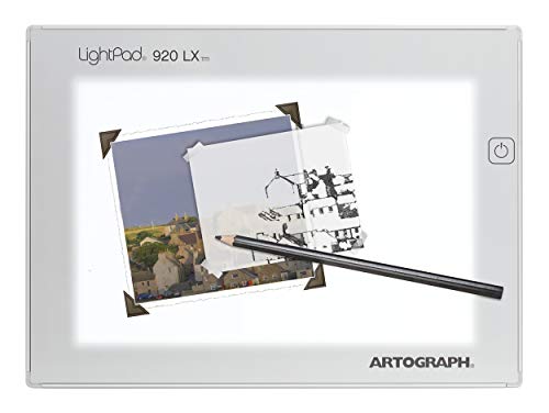
Two things actually accelerate early progress: a structured workbook (so you're practicing the right technique instead of reinforcing bad habits) and a lightpad (so you can trace guide sheets and build muscle memory for correct letterform angles). Most beginners skip both and plateau at the same frustrating point. Spend $30 here and you'll short-circuit months of slow drift.
Best starter
Watson-Guptill
Modern Calligraphy by Molly Suber Thorpe
$15.05 as of Jun 22, 2026
★★★★★Our rating· Only 1 left in stock - order soon.
The most widely recommended calligraphy book for beginners. Suber Thorpe walks through brush lettering and pointed-nib calligraphy with clear instruction, practice alphabet sheets, and sharp editorial judgment about what actually matters in the learning process. Read it once for the instruction, then keep it on your desk as a reference for letterform consistency.
What we like
Practice alphabet sheets built in, removes guesswork from daily drill sessions
Written by a working calligrapher who teaches, not just a technique rundown
What to know
Focuses on modern and pointed-nib script, not useful for gothic or blackletter
★★★★☆Our rating· Only 10 left in stock - order soon.
A lightpad lets you trace practice guide sheets and letterform templates, which massively accelerates early progress. You're building muscle memory for correct angles and proportions without guessing. The A920 is thin, bright, and large enough to fit most practice sheet sizes. Once your consistency is solid you stop needing it, but in the first month it's worth every dollar.
What we like
Trace slant guides for instant angle consistency, the fastest route to uniform letterforms
Thin, bright, and large enough for standard practice sheet sizes
What to know
Guide sheets need to be printed separately (none included)
Most beginners pick up a brush pen and try to write their name beautifully on day one. It goes terribly. The good news: that's the wrong order. Here's what your first four weeks actually look like when you build from the right foundation.
Calligraphy has a reputation for being slow and difficult. It is slow. The difficulty part is mostly about practice order, not natural talent, and most beginners practice in the wrong order.
The mistake is trying to write letters before you can control the tool. It’s the equivalent of trying to drive before you’ve learned to steer. You’ll produce letters that look roughly like letters, you’ll be frustrated that they don’t look like the calligraphy you’ve seen, and you’ll assume you’re just not good at this.
You’re not bad at calligraphy. You just haven’t done the drills yet.
Week 1: Drills before letters
Spend the entire first week on drills. This feels like homework. It is homework. It works.
The core drills for modern brush calligraphy:
Upstrokes. A thin, diagonal line from lower-left to upper-right, made with light pressure. The thinner the better. One page of upstrokes, filling every line of your practice sheet, takes about five minutes.
Downstrokes. A thick, diagonal line from upper-right to lower-left, made with heavy pressure. You’re pressing the brush tip down until it splays wide. The contrast between this and the upstroke is the whole aesthetic of calligraphy: that thick-thin variation is what you’re training.
Oval drills. Thin on the in-stroke, thick on the down-stroke. Think of drawing an oval where the left side is heavy and the right side fades to a hairline. This is the basis for the letters o, a, d, g, q (roughly half the alphabet).
Compound curves. The n-shape (thin up, thick down, thin up) and the u-shape (thick down, thin up, thick down). These are the bones of letters like n, m, h, u, y.
Do 20 minutes of these every day in week one. You will be bored. Your hand will start to understand what you’re asking of it anyway.
By day four or five, you’ll notice your upstrokes getting thinner and more consistent. That’s the signal that your hand is learning.
In week two, you apply the drills to letters, but you’re going to work through them in groups based on shared stroke shapes, not alphabetical order.
Start with the entrance-stroke letters: i, u, w, t, j, p. These all begin with an upstroke entrance and are built almost entirely from the drills you’ve been doing.
Next, the oval-based letters: a, d, g, q, c, e, o. The oval drill from week one is the foundation of all of these. An ‘a’ is an oval drill with an entry stroke and an exit stroke. A ‘d’ is the same oval with a tall upstroke to the right. Once you see the pattern, these come faster.
Then the arch letters: n, m, h, b, k, r. These are compound curves: the n-shape stacked and combined.
Finally, the transition letters: f, x, z, v, y, and the capitals, which are their own system and can wait until month two.
Write each letter 20 times, then try words. Real words are harder than isolated letters: you now have to transition between the exit stroke of one letter and the entrance stroke of the next. This transition (called a joining stroke) is one of the hardest things to make look natural, and you’ll be working on it for months. Don’t expect it to feel smooth yet.
By week three, your individual letters probably look decent in isolation. Your words look inconsistent. This is completely normal and it’s where most beginners get discouraged. Don’t.
Slant consistency is the biggest unlock. Calligraphy looks deliberate when every letter leans at the same angle, typically between 52° and 55° from horizontal for most modern scripts. When letters lean at different angles, the writing looks unstable and amateurish even when each individual letterform is good. Use a slant guide sheet under your paper: a sheet with diagonal angle lines you can see through the paper, which keeps your letters aligned. Print one for free from The Postman’s Knock.
Spacing comes from your oval drills. A useful rule: the white space inside each letter and the white space between letters should feel roughly equal. If your letters are too tight, they look cramped; too loose, they don’t read as a word. Hold your practice sheet at arm’s length and see if the letter spacing feels even. Your eye is a better judge than any ruler.
Write slowly. This is where impatience wrecks most beginners. Calligraphy at proper speed is genuinely slow, slower than you think looks natural. The pen should be moving deliberately, not skating across the paper. If your letters are wobbly or inconsistent, the first fix is almost always to slow down.
By the end of week three, write your name ten times in a row. Compare the first and last versions. The variation will be smaller than in week one.
Week 4: Building a consistent practice
Week four is about consolidation. You have the alphabet. You have the drills. Now you’re training your hand to produce consistent results on demand rather than occasionally.
Pick one word and write it 50 times. Not spread across the week, but all in one session. This sounds extreme. The repetition is the point: you’ll see exactly where your consistency breaks down (always in the same transitions, always in the same letters), and you’ll start correcting without thinking about it.
Try short quotes and phrases. Three to five words, arranged so the composition fits your paper. This introduces a new challenge: deciding where to start, how large to write, and how to use the space. It’s your first real calligraphy piece rather than a practice drill. It will look worse than your individual letters. That’s expected. Make five attempts at the same phrase; the fifth will look noticeably better than the first.
Set up a practice ritual. The calligraphers who improve fastest practice for 15-20 minutes every day rather than 2 hours on weekends. Your hand builds consistency through repetition across days, not through marathon sessions. A notebook open on your desk, a pen within reach, and a 20-minute block after dinner: that’s a practice that sticks.
By the end of month one, your letterforms will be recognizably calligraphy. Not perfect (you’ll see the inconsistencies more clearly than anyone else does), but clearly intentional, clearly controlled, and clearly improving.
Things you’ll fail at (and that’s normal)
Letter size drift. You start writing and your letters gradually get smaller (or larger) across a word. Happens to everyone. A guide sheet with a baseline and cap height line solves it instantly.
Joining strokes that look wrong. The transition from the exit stroke of one letter to the entrance stroke of the next is the hardest thing to naturalize. It takes months, not weeks. Don’t fight it; just keep writing words.
The oval not closing. Your ‘a’s and ‘o’s have gaps where the stroke doesn’t meet cleanly. This is a pressure-timing problem; you’re lifting the pen a hair early. Slow down and stay on the paper until the stroke is complete.
Ink blobs at the start of strokes. The nib pools ink when you pause before starting. Fix: don’t pause. Start moving the instant the nib touches paper.
Comparing your week-three work to expert examples. Those writers have been doing this for years. Compare your week-three work to your week-one work instead. The difference will be dramatic.
What to do in month two
Learn the capitals. Uppercase calligraphy letters are more decorative and more variable than lowercase. There’s no single “correct” capital A the way there is a standard lowercase ‘a’. Study exemplars (IAMPETH has hundreds) and find shapes you want to copy, then practice them with the same drill discipline you applied to lowercase.
Attempt an envelope. Addressing an envelope in calligraphy is the first real-world application and a genuinely good teacher. The format constraints (limited space, address layout) force you to plan your composition. Start with a friend’s birthday card.
Try a dip pen. If you’ve been on brush pens, month two is about the right time to try a pointed nib and ink. The feel is completely different and the learning curve restarts, but the basics you’ve built (slant, spacing, pressure intuition) transfer immediately.
Save your money
What you don't need yet
Beginners get pressured to buy a lot of stuff that doesn't help them play
better. Here's what we'd skip on day one.
A complete calligraphy kit — Amazon calligraphy kits bundle low-quality nibs and watery ink that make the hobby feel harder than it is. Build your own kit from individual pieces.
Ink in multiple colors — Master consistent black letterforms first. Color ink and metallic inks introduce new consistency challenges on top of the fundamental ones.
Metallic or pearlescent ink — These flow differently than India ink, clog nibs faster, and require different preparation. They're genuinely fun, just not for month one.
Vellum or specialty calligraphy paper — Rhodia and HP 32 lb perform as well or better for practice. Vellum can actually be harder to work with because it resists ink more than smooth coated paper.
A custom pen grip or exotic pen holder — The standard Speedball oblique holder works for 90% of beginners. Fancy holders become meaningful when you're writing for hours, not in month one.
First week
Your first seven days
A short, real plan to get from gear-on-doorstep to actually playing.
Order your brush pen set so it arrives before the weekend. · Buy
Set a daily 20-minute session: 15 minutes of drills, 5 minutes of letters. Consistency beats long sessions every time. · Action
Take a photo of your day-one practice sheet. You'll want it in month two when you can't believe how much you've improved. · Action
FAQ
Common questions
Brush pens or dip pens: which should I start with?
Brush pens for most people. They require zero setup, are more forgiving of inconsistent pressure, and you can be producing decent-looking letters within a week. Dip pens give you the classic thin-thick pointed-nib look but demand more patience and the right paper from the start. If you've seen Copperplate or Spencerian script and that's what you want, start with the dip pen, but budget for frustration in weeks one and two.
How long does it take to learn calligraphy?
Most people produce recognizably good letterforms within 3-4 weeks of daily practice. Consistent-looking words take about 6-8 weeks. A full alphabet you're proud of is about 2-3 months. The pace depends almost entirely on how consistent your practice sessions are: 20 minutes daily beats 2 hours once a week, every time.
Do I need special ink for calligraphy?
If you're using brush pens, no: the ink is built in. For dip pens, yes: regular fountain pen ink is too watery and won't give you the crisp coverage you want. India ink (Speedball Super Black is the go-to) is the right tool. Don't use acrylic paint or paint-marker refills, as they dry too fast and clog nibs.
What's the difference between calligraphy styles?
The main modern styles: Copperplate and Spencerian use a flexible pointed nib and produce loopy, dramatically swelled letters (what you picture when you think 'fancy calligraphy'). Italic uses a broad-edge nib and produces neat, angular letterforms. Modern brush lettering uses a brush pen and is more freeform. Start with brush lettering for fastest results; graduate to pointed nib when you want more precision.
Can I learn calligraphy without taking a class?
Absolutely. The calligraphy community has some of the best free online instruction of any hobby. The Postman's Knock, IAMPETH, and YouTube between them cover more than any single class. That said, a single session with a local instructor around month two or three will identify your specific bad habits faster than any video, and those habits are hard to spot yourself.
How much should I expect to spend to start?
Under $30 for a genuine start: a 4-pack of Pentel Fude Touch pens and a pack of HP Premium 32 lb paper. Around $55 for a comfortable setup: the Tombow brush pen set, a Rhodia dot pad, and the Molly Suber Thorpe workbook. You don't need a dip pen, ink, or a lightpad to start; those come when you've decided this is sticking.
The Postman's Knock — Lindsay Ostrom's blog is the single best free resource for calligraphy beginners. Extensive tutorials, free practice sheet printables, beginner guides for pointed nib and brush lettering. Start here.
IAMPETH — The International Association of Master Penmen, Engrossers and Teachers of Handwriting. Free historical exemplars, scanned instruction manuals, and the deepest reference library for Copperplate and Spencerian script on the internet.
r/Calligraphy — Active community with generous critique culture. Post your practice sheets and get specific feedback; the regulars are patient with beginners and genuinely helpful.
Molly Suber Thorpe — Author of Modern Calligraphy and one of the most respected instructors in the field. Her website has workshop listings, additional tutorials, and resources beyond the book.
The Postman's Knock (YouTube) — Video companion to the blog. Excellent drill and letterform tutorials with clear on-paper instruction. Start with the basic drills series before the alphabet videos.
As an Amazon Associate, JustBeginning earns from qualifying purchases.
We may also earn commission from other affiliate programs linked on this
page. Editorial recommendations are independent; we don't choose
products based on commission rates.
Product prices and availability are accurate as of the date and time
indicated and are subject to change. Any price and availability
information shown on Amazon at the time of purchase will apply.
Our top pickTombow Dual Brush Pen Art Set (10-Pack)