Hand lettering is one of the cheapest creative hobbies around. A $20 set of brush pens and a ream of smooth paper is all you need. The learning curve is satisfying, and you'll have something worth sharing within your first week. Here's what to buy and what to skip.
By Colin B. · Published May 23, 2026 · Last reviewed June 4, 2026
A $20 brush pen set and a ream of smooth paper gets you started. Add a workbook and a light pad once you know it's sticking.
We earn commission on qualifying Amazon purchases — see our
affiliate disclosure.
Price tiers and budget totals shown above are editorial estimates;
actual Amazon prices vary.
At a glance
Our top pick in each category
The fastest path through this guide — each best-starter pick by category.
Scroll for the budget and upgrade alternatives.
Your handwriting doesn't matter. Hand lettering isn't an extension of everyday writing. It's drawing letters deliberately, stroke by stroke. Messy handwriting is no predictor of success here.
Paper matters as much as pens. Brush pen tips fray on rough surfaces. Skip standard copy paper and buy a ream of HP Premium 32lb laser paper on day one. Your pens will last three times as long.
Start with brush pens, not calligraphy sets. The elaborate dip-pen kits marketed to beginners introduce mess and technical complications before you've learned the basics. A set of Tombows and smooth paper is a far better first week.
Brush pens are the entry point for most hand letterers: no inkwell, no mess, available in every color, and the flexible tip gives you the thick-thin contrast that defines the style. Press hard on downstrokes, go light on upstrokes. That's the whole trick. Start with a set of 10–20 colors in a medium soft tip. You'll be making actual projects within a week.
Brush Pens — what's the difference?
A few common shapes, each making a different trade.
Soft / Flexible Brush Tip
Pressure-sensitive, wide thick-thin range. The classic brush lettering look.
Tip flexibility
High
Stroke range
Maximum
Learning curve
Moderate
Best for Cursive brush script, Instagram-style lettering, most beginners
Tradeoff Tips fray fast on rough paper; less forgiving of heavy-handed technique
Consistent line width, more like a marker. Better for block lettering and headers.
Tip flexibility
Low
Stroke range
Limited
Learning curve
Easiest
Best for Block lettering, print-style headers, beginners who want more control
Tradeoff Less expressive than flexible tips; not suited for connecting script styles
Fine Pointed Brush
Tiny, precise tip for detailed work and small-scale lettering.
Tip flexibility
Medium
Stroke range
High at small scale
Learning curve
Steeper
Best for Address envelopes, fine-detail work, small greeting cards
Tradeoff Short strokes only. Not suited for large display lettering.
Best starter
Tombow
Dual Brush Pen Art Markers (10-pack)
$22.28 as of Jun 22, 2026
★★★★★Our rating· Only 10 left in stock - order soon.
Tombow Dual Brush Pens are the community's universal starting point. The flexible nylon tip responds to pressure beautifully: heavy downstrokes go thick, light upstrokes go thin. The 10-color set has enough variety to make real projects without overwhelming you. Dual-ended so the fine tip handles details and outlines.
What we like
Flexible nylon tip makes thick-thin contrast almost automatic
Dual-ended: brush on one side, fine felt-tip on the other
Water-based ink blends with water and other Tombows
What to know
Tips fray fast on rough paper. Smooth paper is non-negotiable.
Half the price of Tombows and a genuinely functional brush pen. The tip is shorter and firmer, with less dramatic thick-thin range, but easier to control. A smart buy if you're not sure this hobby will stick before you commit to a premium set.
What we like
Real brush tip with genuine pressure response, not a stiff marker
Half the cost of Tombow sets, a low-stakes entry point
What to know
Shorter, firmer tip limits stroke variety compared to Tombows
★★★★☆Our rating· Only 4 left in stock - order soon.
Japanese brush pens with the most watercolor-like ink of any pen set. Water-soluble, meaning you can blend two colors wet-on-wet for beautiful gradients. Switch to these once your letterforms are solid and you want more artistic range.
What we like
Water-soluble ink blends like real watercolor, unique in this category
Flexible super-fine tip gives maximum stroke variation
Rich, saturated colors photograph beautifully
What to know
Higher per-pen cost than starter sets
Requires paper that handles moisture without warping
Smooth paper is the most important thing most beginners overlook. Rough surfaces shred brush pen tips in one session. HP Premium 32lb laser paper is the community's open secret: smoother than most branded art pads, no bleed-through, and $15 for 500 sheets. Once you have the right paper, your pens will last three times as long.
Best starter
HP
Premium 32lb Laser Paper (500 sheets)
$23.42 as of Jun 22, 2026
★★★★★Our rating· In Stock
The hand-lettering community's open secret. A $15 ream outperforms most specialty pads: silky smooth, no bleed-through, zero feathering. Your brush pen tips will last three times as long as on rough paper. Buy the ream: at 500 sheets, it lasts months of daily practice.
What we like
Silky-smooth surface, the single biggest protector of brush pen tips
No bleed-through; Tombow ink stays exactly where you place it
500 sheets at $15, months of practice at almost no cost
What to know
Not suitable for water-heavy techniques. Paper warps with wet brush.
Slightly translucent layout paper. Hold a guideline sheet under it and you can trace letter spacing and slant without redrawing guides every session. A good choice for structured practice before going fully freehand.
What we like
Translucent enough to trace guidelines from underneath
Smooth surface compatible with most brush pens and markers
What to know
More expensive per sheet than HP laser paper
Lighter weight, and heavier brush pen ink can bleed through
Rhodia's vellum finish is the smoothest paper in this roundup. The dot grid guides your slant and letter height without the visual noise of lines. Reserve this for pieces you plan to keep. It's too good for daily drills.
What we like
Vellum surface feels silky under every pen tested
Dot grid guides slant and baseline without cluttering your composition
What to know
80 sheets runs out fast at a daily practice pace
Premium price makes it guilt-inducing for throwaway drills
Not all hand lettering uses brush pens. Broad-nib tools (like the Pilot Parallel Pen) give you crisp, architectural letterforms with a very different aesthetic. If you're drawn to the structured italic and Gothic styles you see in wedding stationery or vintage posters, this is your category. Start with the Pilot Parallel; it uses ink cartridges so there's no inkwell to manage.
Best starter
Pilot
Parallel Pen 3.8mm
$12.99 as of Jun 22, 2026
★★★★★Our rating· In Stock
The easiest entry into broad-nib calligraphy. Uses ink cartridges, no inkwell, no dipping, no mess. Writes immediately out of the box. The 3.8mm flat nib makes beautiful Italic letterforms without any technique, just by holding the pen at the right angle.
What we like
Cartridge ink means no inkwell, clean, portable, beginner-proof
Flat nib produces thick-thin contrast automatically at the right angle
Available in four nib widths. Upgrade to 6mm once comfortable.
What to know
Small cartridge runs dry mid-session if writing a lot
Flat nibs produce a specific look, different from brush pen styles
Speedball's starter set with multiple nibs and a pen holder covers the basics of both Italic and Copperplate styles. The dip-pen experience forces you to slow down and be deliberate, which is surprisingly good for learning letterform fundamentals.
What we like
Multiple nib sizes cover Italic and Copperplate styles in one kit
Dip-pen pace forces deliberate, controlled strokes
What to know
Nibs rust if not rinsed and dried after every session
Inkwell and constant re-dipping is messier than cartridge pens
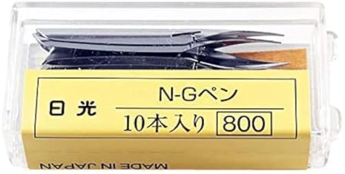
For pointed-pen styles like Copperplate and Spencerian, the Nikko G is the most popular beginner nib worldwide: flexible enough on pressure, sturdy enough not to snap. Pair with any straight or oblique pen holder (sold separately). The 10-pack means you can practice without worrying about ruining a nib.
What we like
Nikko G is the most recommended starter nib for Copperplate worldwide
Oblique holder eliminates wrist strain on slanted script styles
What to know
Nibs catch on rough paper and spit ink. Only works on very smooth surfaces.
Steeper learning curve than any other tool on this list
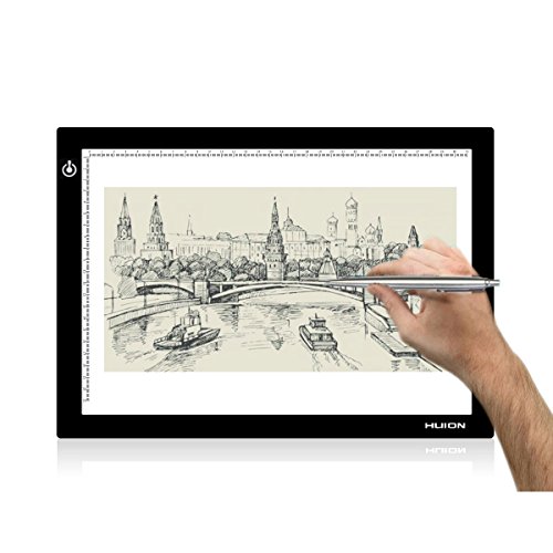
A light pad (light box) lets you place a printed guideline sheet under your practice paper and see through to trace letter spacing, baseline, and slant without redrawing guides every session. It seems optional until you own one. Cuts setup time in half and improves consistency dramatically, the single biggest quality-of-life upgrade in this hobby.
Best starter
Huion
L4S A4 LED Light Pad
$37.99 as of Jun 22, 2026
★★★★★Our rating· In Stock
Huion makes the most reliable light pads at a reasonable price. The A4 size fits most lettering projects, brightness is adjustable for different paper weights, and USB power means it runs from any laptop or wall adapter. Far better build quality than no-name pads.
What we like
Adjustable brightness works through multiple paper thicknesses
USB-C powered, no extra adapter, works from any laptop
Even illumination across the full surface, no hot spots
What to know
A4 fits most projects but is too small for poster-format lettering
Glass surface scratches. Lay a sheet of paper on top as a buffer.
The AC-powered Huion A4 is the budget entry into light pads. Plugs into any wall outlet, illuminates evenly, and works fine for desktop setups. If you're mostly lettering at a fixed desk, you won't miss the portability of the USB models.
What we like
Under $20, the lowest-stakes way to try a light pad
USB-powered from any phone charger
What to know
Fixed brightness may not penetrate heavier paper weights
Surface flexes more than premium pads and gets warm after 30 minutes
Practice without structure is how you develop bad habits. A good workbook teaches you the right stroke order and letterform proportions before you have the eye to spot what's wrong. Start with one book, work through it completely, then free-practice. Jumping between resources too early is the most common beginner mistake.
Best starter
Penguin Random House
The Ultimate Brush Lettering Guide by Peggy Dean
$19.99 as of Jun 22, 2026
★★★★★Our rating· Only 7 left in stock (more on the way).
The most-recommended starting point in the brush-lettering community. Teaches warm-up strokes before letters, letters before words. The right progression. Actual practice pages with guides printed, not just inspiration photos. Most people who finish it have something they're genuinely proud of.
What we like
Teaches warm-up strokes first, building muscle memory correctly
Printed practice pages with guidelines included
Step-by-step progression from single strokes to full compositions
What to know
Brush-pen focused, less useful if you're going the dip-pen route
Practice pages run out; you'll need your own paper for continued drills
★★★★☆Our rating· Only 1 left in stock - order soon.
The definitive guide to pointed-pen calligraphy. If you've worked through a brush-pen workbook and want to move into dip nibs, Copperplate, or wedding-envelope styles, Molly Suber Thorpe's guide is the clearest transition resource available.
What we like
Comprehensive coverage of pointed-pen styles including Copperplate
Practical guidance on nib, ink, and paper selection for pointed-pen work
What to know
Not the place to start. It assumes you have basic letterform control.
★★★★☆Our rating· Only 3 left in stock - order soon.
A playful, project-oriented lettering book. Where Peggy Dean is systematic, Amy Latta is loose and creative: every exercise produces a finished piece you'd actually want to put on your wall. A better fit if fun projects motivate you more than drills.
What we like
Project-focused: each exercise produces a finished piece
Lighthearted tone makes practice feel like play
What to know
Less systematic than Peggy Dean. Won't build stroke fundamentals as rigorously.
Humor-focused style doesn't transfer easily to formal lettering work
You don't need neat handwriting to start. You need repetition and the right order. Here's what the first four weeks actually look like.
Hand lettering has a reputation for being something you either have a gift for or you don’t. That’s wrong. It’s a motor skill, which means it responds to repetition the same way shooting free throws or typing does. The people who get good aren’t naturally talented. They practiced in the right order.
This is what that order actually looks like across your first month, with the plateaus, the breakthroughs, and the things that are worth worrying about versus the things that aren’t.
Week 1: Strokes, not letters
The single most common beginner mistake is reaching for the alphabet too soon. Before you write a single letter, spend your first week on the basic strokes that every letter is built from.
For brush lettering, those strokes are: the full-pressure downstroke, the light-pressure upstroke, the oval (the foundation of every a, b, d, g, o, p, and q), and the underturn and overturn (the curves that connect letters in script). They’re boring to practice and transformative in what they teach your hand.
Here’s the mechanical key to brush lettering: apply pressure on every downstroke, release pressure on every upstroke. The thick-thin contrast that makes brush lettering look the way it looks is entirely a function of this pressure change. Your pen isn’t doing magic. You are. Practice this until it’s automatic. Twenty minutes a day, every day of week one, nothing but strokes.
Don’t worry about what it looks like yet. You’re training your hand, not making art.
By week two you have enough muscle memory to start forming letters. Work alphabetically through lowercase first. The lowercase brush script alphabet is faster to learn and more immediately useful than capitals. Start with groups of letters that share similar strokes: a, d, g, q share the oval; n, m, h share the arch.
Two things to notice this week:
Your downstrokes will want to be too thick. The instinct when learning pressure response is to overdo it. A good brush lettering downstroke is thick, not fat, somewhere between two and three times the width of an upstroke. If everything looks like spaghetti versus linguine rather than hair versus ribbon, ease back.
Your letters will want to lean inconsistently. Pick a slant angle and stick to it. Around 55–65 degrees from horizontal is standard for brush script. Print a guideline sheet (you can find them free on Lettering Daily or any hand-lettering YouTube channel), slip it under your smooth paper, and let the light pad do the work of keeping you consistent.
By the end of week two, you should be able to write full words. They won’t be beautiful yet. That’s correct.
Week 3: Compositions and layouts
Words become phrases, phrases become layouts. Week three is where hand lettering stops feeling like practice and starts feeling like making something.
A few principles that separate compositions that look intentional from ones that look like an accident:
Baseline variation is not randomness. The “bouncy” style where letters sit at different heights looks loose and energetic, but every rise and dip is deliberate. The tall letters (h, l, t, d, b, k) reach up; the descenders (g, y, p, q) drop down; the mid-height letters (a, e, m, n, u, w) cluster in the middle zone. Practice exaggerating this intentionally before trying to make it look natural.
Contrasting letterforms make layouts interesting. Pair a script word with a printed word. Add a serif drop-cap. Let a word fill the width of your page while the next word is small. Hand lettering’s advantage over typography is that you can break any rule. Exploit that.
Start a project this week. A favorite quote, a name, something you’d actually frame. It’ll be imperfect. Finish it anyway.
By week four, some styles feel natural and some feel forced. That’s your style starting to emerge.
Hand lettering eventually sorts into two tendencies: clean and structured (consistent slant, even spacing, controlled strokes) or loose and expressive (bouncy baselines, organic variation, faster pace). Neither is better. The clean version reads as elegant; the loose version reads as warm. Most letterers end up somewhere on a spectrum between the two.
This week, try deliberately working at both ends. Spend a session doing everything slow, consistent, and controlled. Spend another session working fast, loose, and spontaneous. Your discomfort with one end will tell you where your instincts live.
Also this week: look at what’s working in your pieces and deliberately keep it. If your downstrokes on a particular letter look great but the connections look rough, spend fifteen minutes only doing that connection. Targeted practice beats general repetition past a certain point.
Gets easier fast: consistent slant, pressure control, spacing within words.
Takes longer than beginners expect: spacing between words, making capitals look intentional rather than like dropped-in extras, and blending styles (brush + print, serif + script) without it looking like a ransom note.
Still hard after a year for most people: getting letterforms consistent at very large and very small scales, and making layouts feel designed rather than assembled.
This progression is normal. The point at which lettering stops feeling like practice and starts feeling like a craft is usually somewhere in month two or three, when you’re making something you’d want to give to someone rather than just keep in a notebook.
Save your money
What you don't need yet
Beginners get pressured to buy a lot of stuff that doesn't help them play
better. Here's what we'd skip on day one.
An elaborate dip-pen calligraphy kit — The fancy sets marketed at beginners introduce inkwells, fragile nibs, and technique complications before you've learned the basics. Start with brush pens.
Copics or luxury illustration markers — Copics are for illustration, not lettering. The cost per marker ($7+) is hard to justify when Tombows do more for lettering at a fraction of the price.
An iPad and Apple Pencil — Digital lettering is a different skill. Learn analog letterforms first. The muscle memory transfers; the reverse is much harder.
A broad calligraphy pen set in every nib size — One Pilot Parallel Pen in 3.8mm is enough to explore broad-nib styles. Buy additional widths only once you know you love the aesthetic.
A paid online course subscription — YouTube has more free beginner hand-lettering content than you could watch in a year. Start there. Courses make sense once you've identified a specific style to master.
First week
Your first seven days
A short, real plan to get from gear-on-doorstep to actually playing.
Order the Tombow 10-pack brush pen set and a ream of HP Premium 32lb laser paper. · Buy
Post your practice sheet by day seven. Instagram and TikTok lettering communities are genuinely supportive of beginners. · Action
FAQ
Common questions
What's the difference between hand lettering and calligraphy?
Calligraphy is a writing technique using specific tools (nib pens, brushes) and strict letterform rules. Hand lettering is broader: it's drawing letters any way you want, often combining styles and decoration. Most beginners start with brush-pen hand lettering, which borrows calligraphy's thick-thin contrast without the strict rules.
Do I need good handwriting to start hand lettering?
No. Hand lettering has nothing to do with everyday handwriting speed. You're drawing each letter deliberately, stroke by stroke, which is a completely separate skill. Some of the best hand letterers have terrible handwriting.
What paper should I buy first?
HP Premium 32lb laser paper. It sounds wrong (it's sold as printer paper), but the surface is smoother than most specialty pads, costs $15 for 500 sheets, and protects your brush pen tips from fraying. The whole lettering community uses it.
Why do my brush pen tips fray so fast?
Almost always rough paper. Any texture in the paper surface acts like sandpaper on the nylon tip. Switch to HP 32lb laser paper and the same pens will last 10x longer. You may also be pressing too hard. Let the tip glide, don't push.
Can I just use cheap brush markers from a craft store?
For your first day, yes. But cheap markers typically have stiff tips with no pressure response, so you won't develop the muscle memory that produces the thick-thin contrast hand lettering is known for. Invest in Tombows or Pentels as soon as you know you're sticking with it.
How long does it take to get decent?
Most people have something they're proud of within two to four weeks of daily 20-minute practice. Legible, consistent letterforms come first, around week two. A personal style starts emerging somewhere in months two or three. The ceiling is very high, but early progress is fast.
Lettering Daily (YouTube) — The most consistent free resource for beginner brush lettering. Structured tutorials, free worksheets in descriptions, and a friendly community. Start here.
Peggy Dean (YouTube) — The author of the beginner workbook we recommend. Free tutorials on YouTube supplement the book. Useful to see her technique in motion.
The Happy Ever Crafter (YouTube) — Clear beginner tutorials focused on brush lettering basics. Good for visual learners who want to watch before they write.
Tombow USA (YouTube) — Product demos and technique tutorials from the maker of the most popular beginner brush pen. Obvious conflict of interest, but the technique content is genuinely useful.
r/Calligraphy — Active community covering both calligraphy and hand lettering. The wiki has a solid beginner guide. Progress posts get genuine feedback, not just likes.
IAMPETH — The International Association of Master Penmen. Deep archive of historical scripts, free PDF lessons from master calligraphers. More than a beginner needs. Bookmark for later.
As an Amazon Associate, JustBeginning earns from qualifying purchases.
We may also earn commission from other affiliate programs linked on this
page. Editorial recommendations are independent; we don't choose
products based on commission rates.
Product prices and availability are accurate as of the date and time
indicated and are subject to change. Any price and availability
information shown on Amazon at the time of purchase will apply.
Our top pickTombow Dual Brush Pen Art Markers (10-pack)


 Best starter